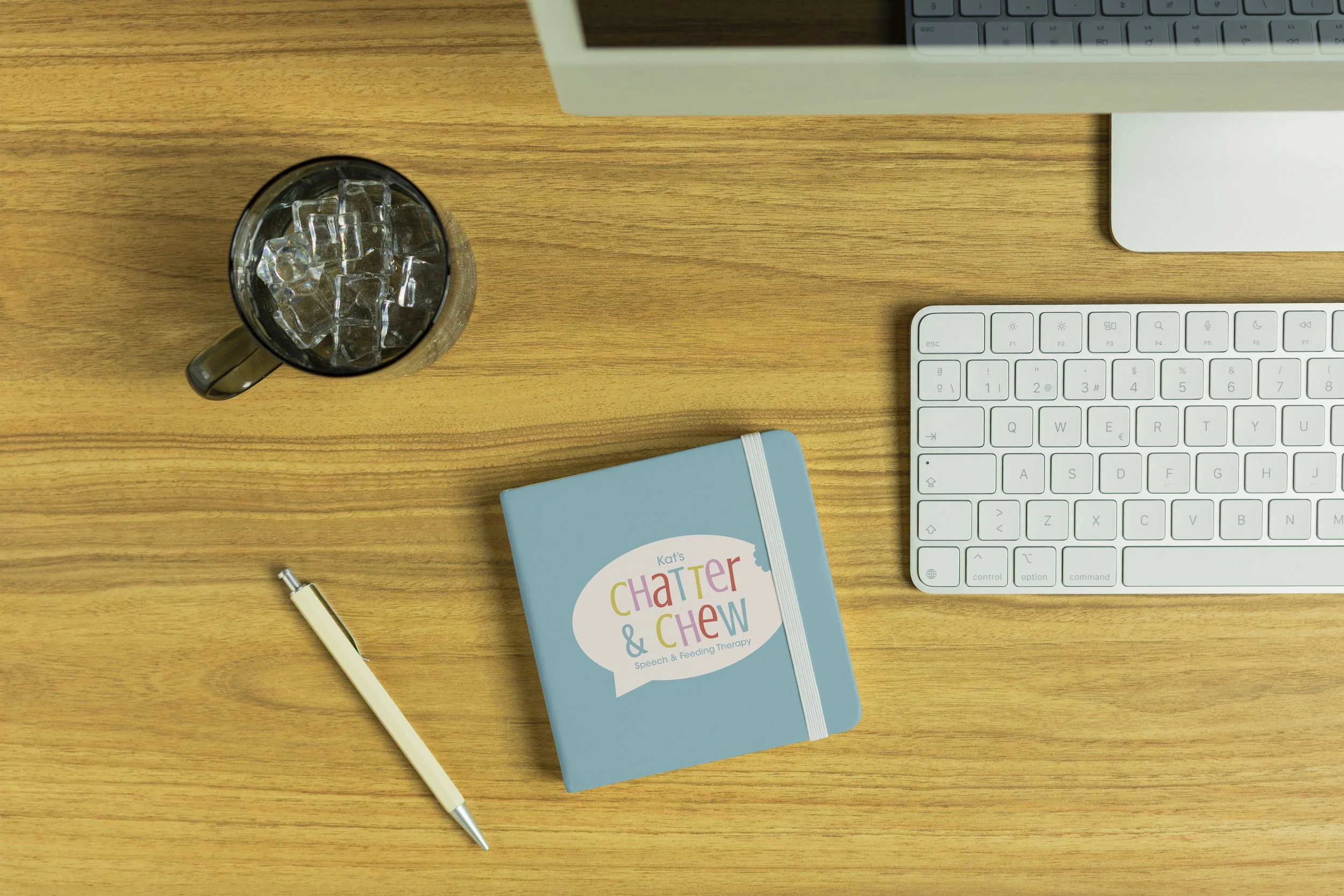
When Kat approached me to create a visual identity for her new speech and feeding therapy practice, she gave a simple brief: something modern, playful, and creative. With minimal direction, I was able to fully explore the brand from the ground up - my favorite kind of challenge.
The goal was to design something that felt fun and approachable while still being polished and professional. The final identity blends bright, cheerful colors with a quirky letterform to create a safe, welcoming feel for kids and families to engage with.
Kat’s Chatter & Chew
Speech & Feeding Therapy

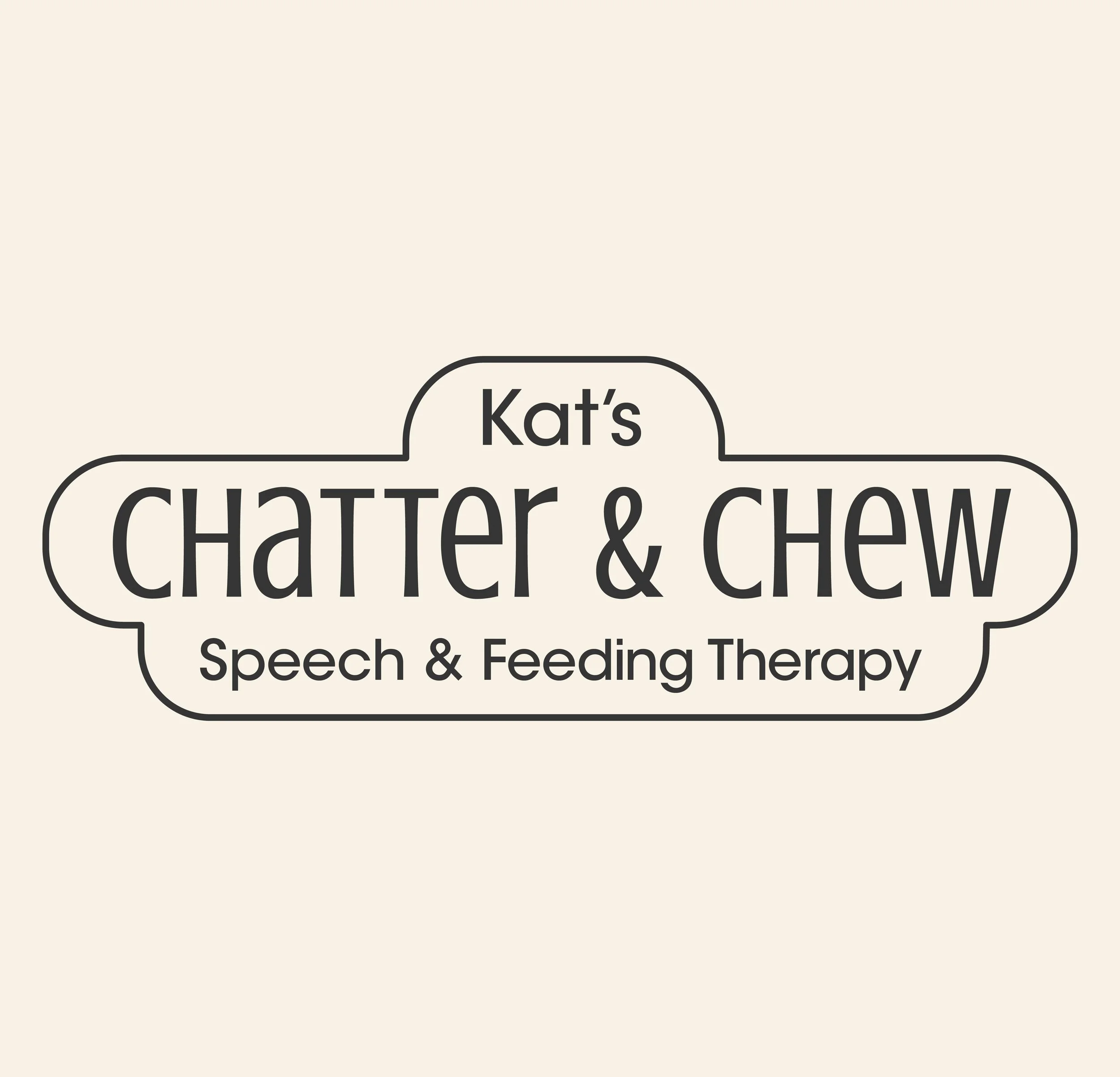
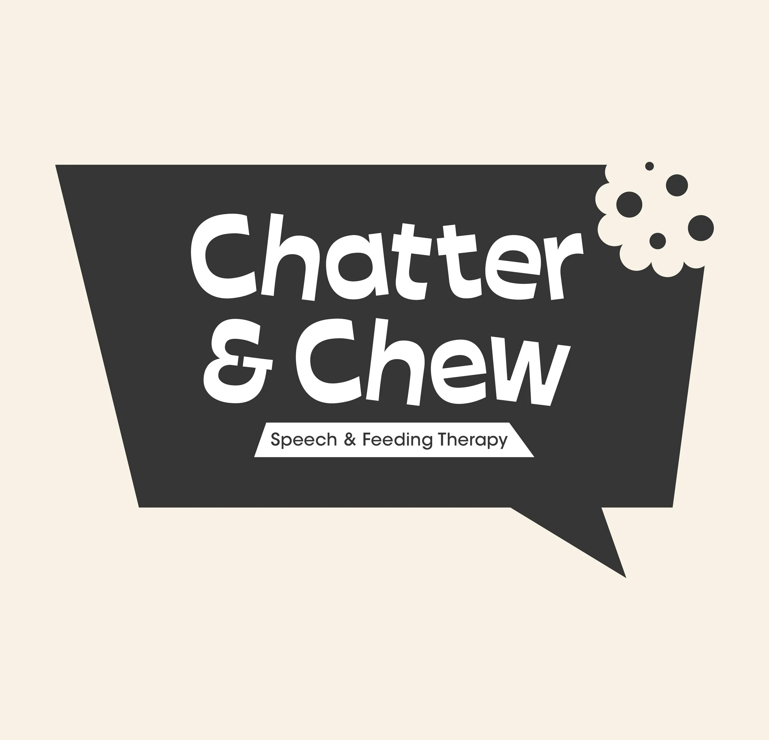
Concept Exploration
Initial explorations focused on different
type treatments and shapes.


Color Exploration
Based on the clients request of using bright and comforting color palettes.

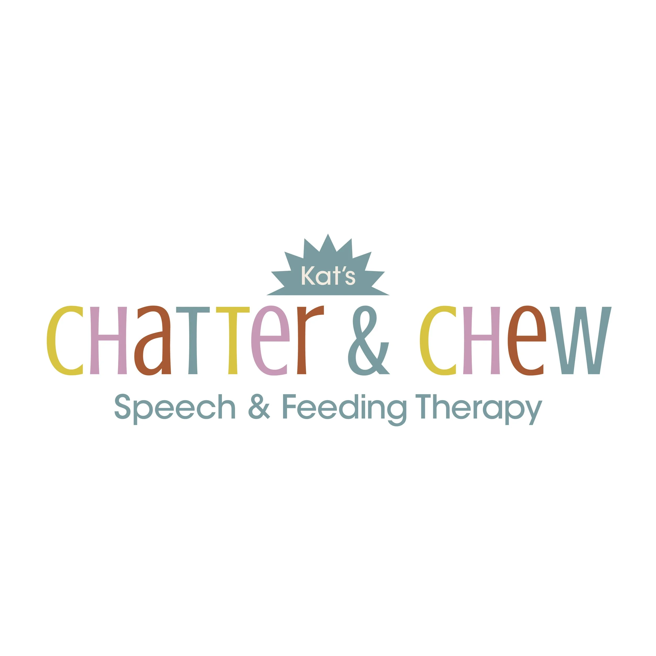

Final Logo & Identity System


