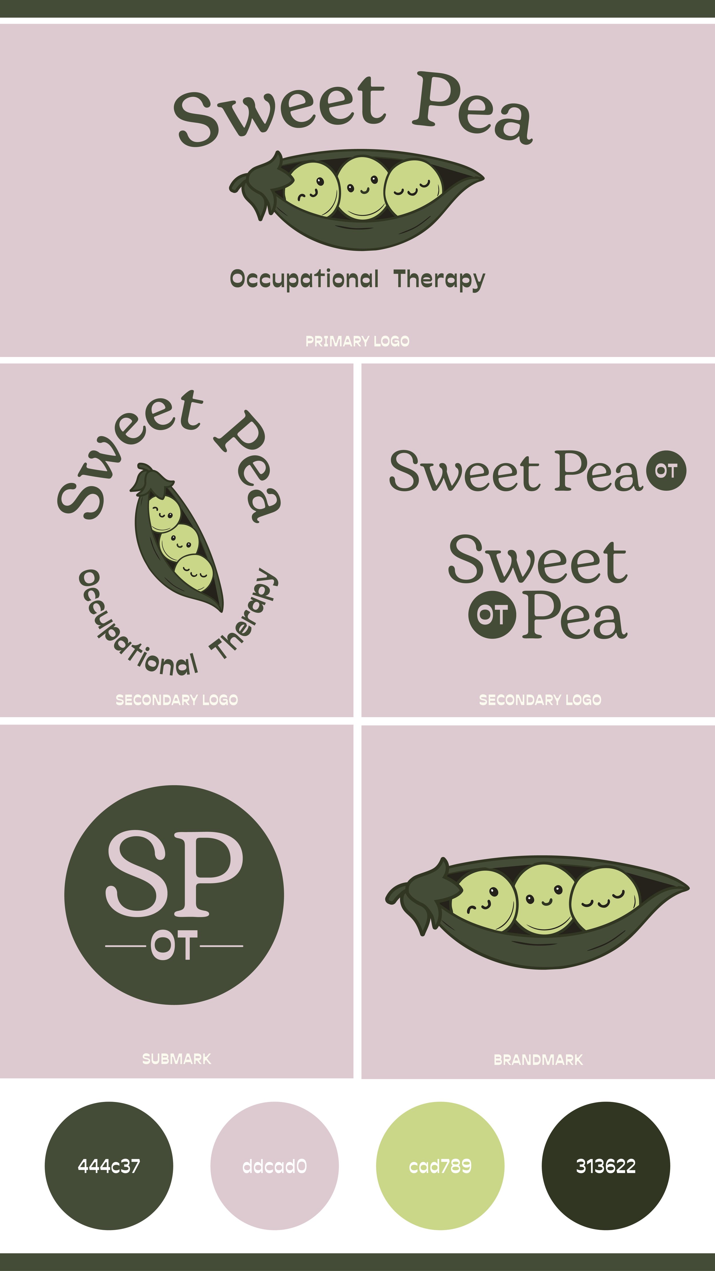
When the client approached me to create a visual identity for her new occupational therapy practice, she wanted something that felt friendly, inviting, and approachable for all ages — not just children. With that in mind, I developed a logo that balances warmth and professionalism, using a playful pea pod illustration paired with clean typography and a soft, uplifting color palette.
The goal was to design a brand that conveys comfort and trust while still feeling modern and refreshing. The final identity captures Sweet Pea’s nurturing approach to therapy — gentle, grounded, and full of heart.
Sweet Pea OT
Occupational Therapy


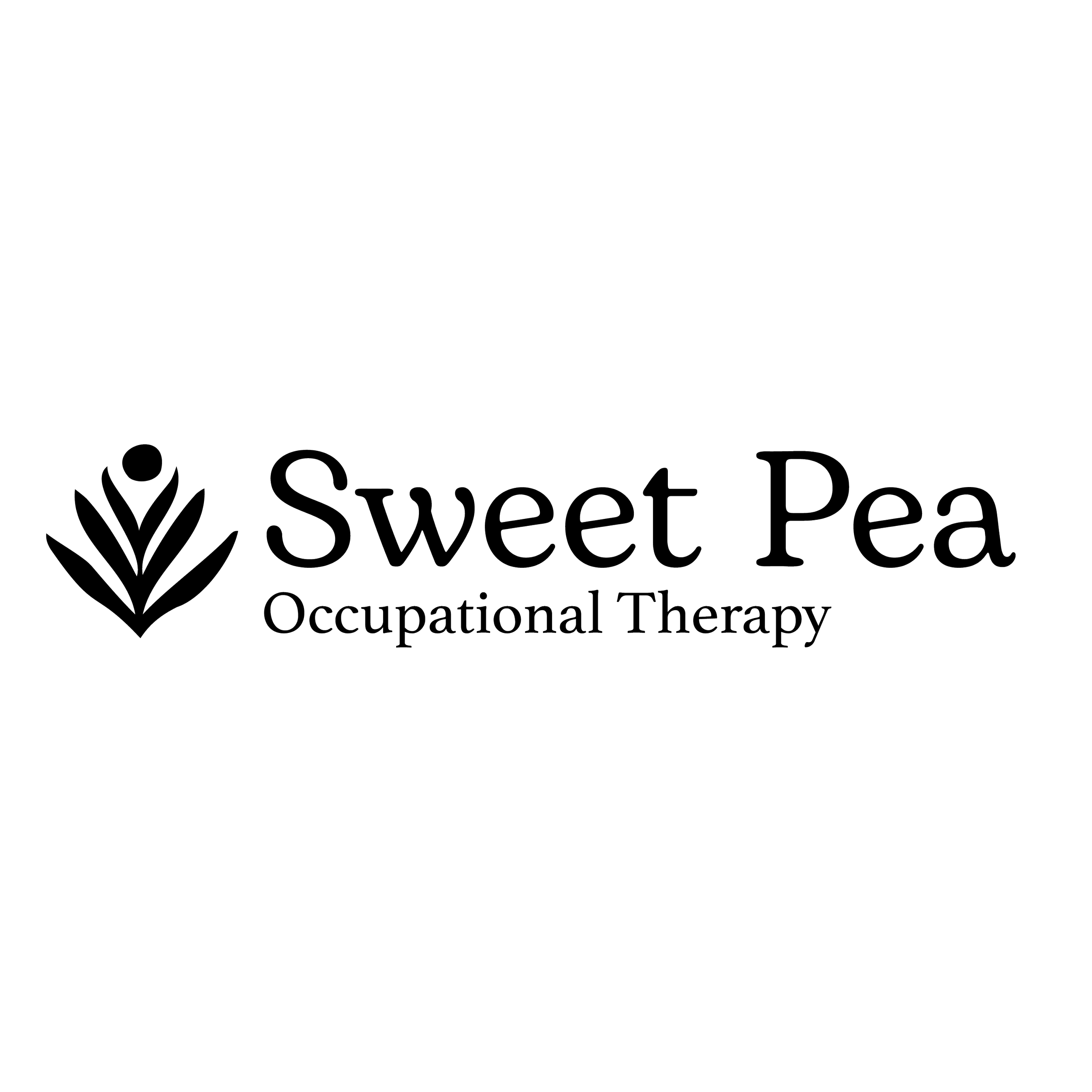
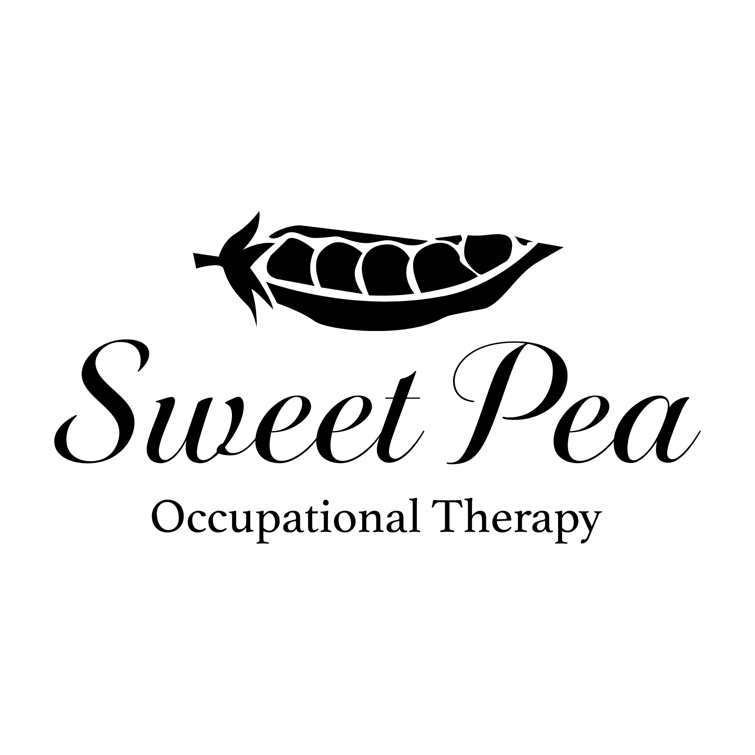
Concept Exploration
Initial explorations focused on different
type treatments and shapes.


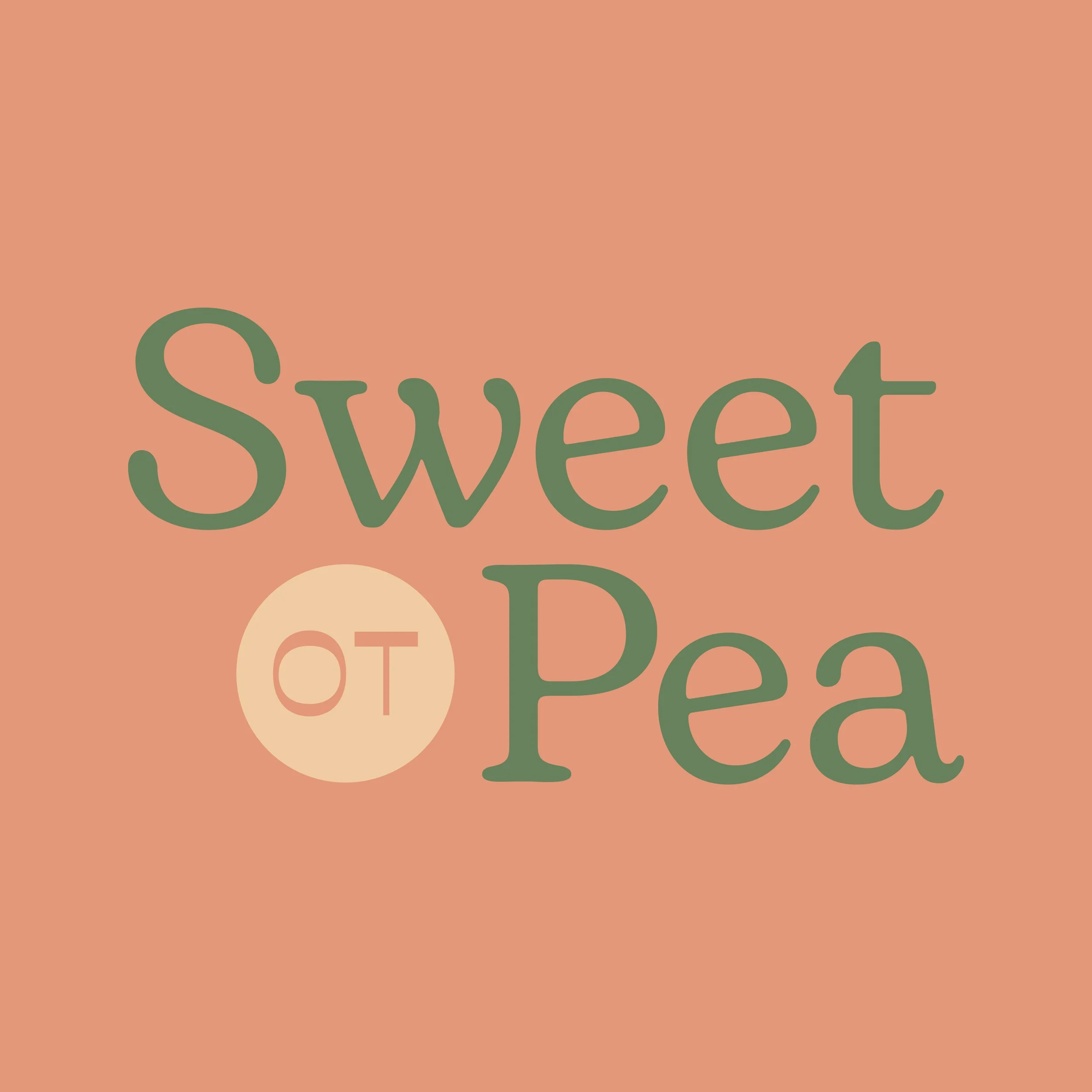
Color Exploration
Based on the clients request of using bright and comforting color palettes.


Final Logo & Identity System